Gestalt Principles of Perception - 3: Proximity, Uniform Connectedness, and Good Continuation
March 28, 2009The reason that what you’re reading right now makes sense to you, other than the fact that you are familiar with the written English language, is due largely to the fact that I’m employing—and you perceive—three important Gestalt Principles. The structure of this paragraph is dependent on its adherence to and consistency with the principles of proximity, uniform connectedness, and good continuation. Without these three factors I would be unable to clearly communicate my thoughts to you through this medium (written/typed words) and what you are seeing would bear little or no relationship to language.
The paragraph is not an arbitrary construct nor was it an optional invention. It is required for written communication; else communicative writing would be relegated to individual words or unwieldy, enormous chunks of copy. For example, the image below shows the first paragraph of this article as it might appear without any reference to the aforementioned Gestalt Principles:
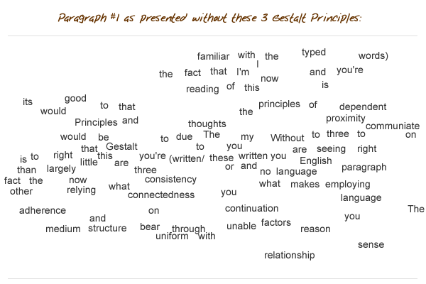
I expect that it would have been difficult or impossible for you to discern my thoughts if I had used this format, having dispensed with the principles of proximity, uniform connectedness, and good continuation.
We employ and rely upon these three principles in most aspects of our lives, with both physically tangible and conceptual components of our experience. In fact we would literally be lost without doing so. Though we all possess an intuitive perception and reliance on them, it is good for a designer to have a granular and working understanding of all three of these principles
Proximity
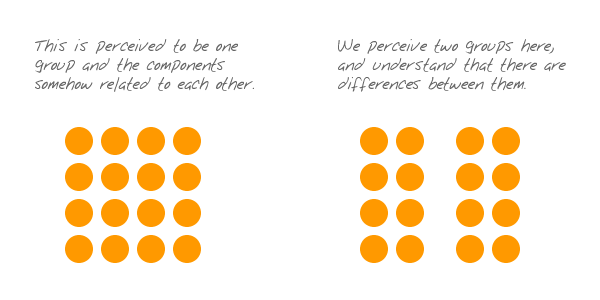
It does not get any simpler than this, folks: things that are close to one another are perceived to be more related than things that are spaced farther apart. As this principle does not rely on any extraneous structure, it is among the first principles to impact our perception and from which we derive understanding. All of us intuitively understand that the simplest way to indicate relatedness is to manipulate proximity. What we might not intuitively understand, however, is how powerful the principle of proximity is.
In the example below, proximity clearly indicates relatedness and relative association:
In the next example however, another Gestalt Principle is added to the mix (similarity), but our perception of proximity overpowers it. We might otherwise associate these elements according to the two distinct colors, but proximity wins the day.
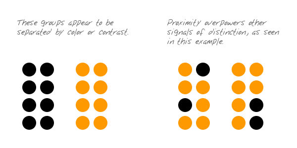
Fundamental mechanisms of our perception are almost always competing with one another, as exemplified in the image above. As a designer, it is important that you understand the relative strengths of these mechanisms so that you can choose which one to exploit in a given situation. There is only one principle of perception that is more powerful than proximity and we get to that one next.
Uniform Connectedness
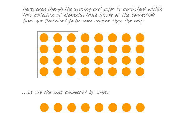
The principle of uniform connectedness is the strongest of the Gestalt Principles concerned with relatedness. It refers to the fact that elements that are connected by uniform visual properties are perceived as being more related than elements that are not connected. As with the principle of proximity, uniform connectedness causes us to perceive groups or chunks rather than unrelated, individual things.
In practice, uniform connectedness is quite simple: draw a box around a group of elements and you’ve indicated that they’re related. Alternately, you can draw connecting lines (or arrows or some other tangible connecting reference) from one element to the next for the same effect. For instance:
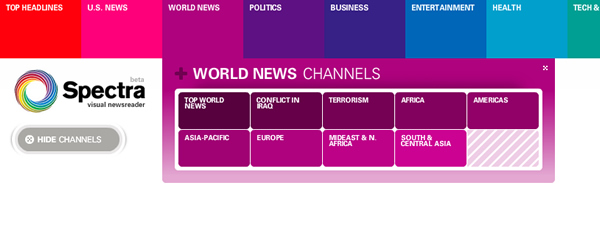
Here’s an example (below) of how uniform connectedness can be useful in organizing a complex interface:

Okay, this is a terrible interface, but it is better than it might otherwise be. In this example (above), one would find the dashboard of a 747 airliner far more confusing if not for the clear context provided by the boxed groupings. The borders around certain groups of controls indicate their contextual relatedness, making function and purpose easier to perceive—as a small number of chunks rather than a large number of individual elements.
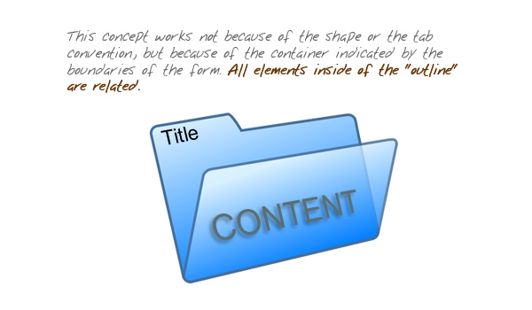
In web design, it is common to employ uniform connectedness to show context. Tabbed navigation is a prime example of this principle. When you have two visually and proximally distinct elements (navigation link – and – page copy), the easiest way to show related context is to enclose disparate elements, like this:

One might think that tabbed navigation is most effective because of our familiarity with the physical and conceptual idea of a filing folder, but the fact is more basic. The filing folder works because of the principle of uniform connectedness, not the other way around.
Here’s an example showing the efficacy of connecting lines …and the problems encountered when they’re not used:

This image (above ) just doesn’t make much sense. What’s missing is the essential element that exploits uniform connectedness. Let’s fix that:

Here (above) we have clear context and have associated the woman with what we now perceive as something she is saying. The speech bubble works not because of graphic or cultural convention, but because of how it is consistent with uniform connectedness. You might notice, however, that while the speech bubble uses an arrow/line to connect the woman to her speech, the man’s thought bubble is doing something different. The thought bubble still works, but for a different reason …and because of a different principle, which we’ll examine next.
Good Continuation
At the start of this article, I made reference to the fact that the paragraph works to accurately and efficiently communicate my thoughts because of proximity, uniform connectedness, and one other Gestalt Principle. The final principle employed here is good continuation, which references the fact that elements arranged on a line or curve are perceived to be more related than elements not on the line or curve. This principle can be clearly perceived in the image above, where the man and the thought bubble are connected by the gently curved arrangement of the smaller bubbles between them (which work like breadcrumbs).
The fact that the words within this paragraph are on a straight line (or series of lines) helps us to understand that they’re related to one another (and is supported by the fact that the words are grouped together with proximity …and the white space around the paragraph depicts a “box”). Clearly, the linear arrangement of the words is a powerful mechanism, as exemplified by the fact that all written language employs the standard principle of good continuation, if not all in the same direction or orientation.
The principle of good continuation advises us on effective ways to indicate relatedness, but not just with words in a paragraph or breadcrumbs toward a thought bubble. Good continuation is especially useful for allowing us to penetrate and understand meaning as indicated by all sorts of visual structures. For example:
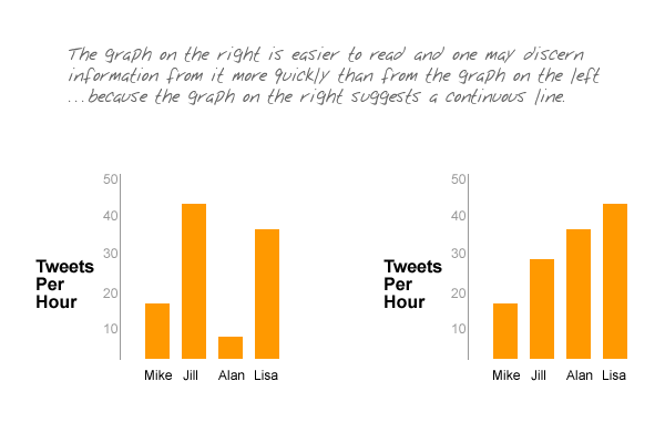

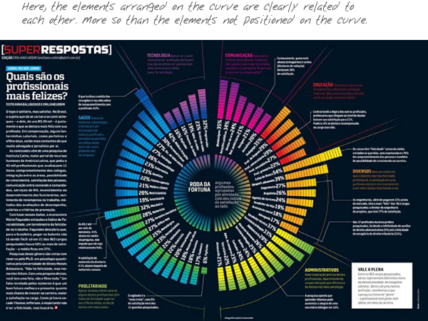
In each of the images above, the components displayed have a clear indication of their relatedness because of how they describe a straight line or are positioned on a continuous curve (and information not on the curve is not as associated as those bits on the curve!). It is therefore easy to suggest or perceive a context that is described by the respective groupings.
When designing a web page, we designers will usually employ a mechanism that facilitates good continuation: the grid. A grid is most useful in bringing order to a layout, but it also is useful in indicating context. For instance, the example below shows how a horizontal-linear configuration helps to preserve context:
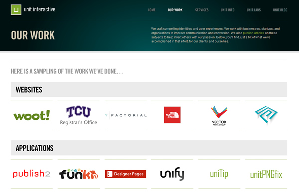
In the above example, several thumbnails are presented under each portfolio category heading. The fact that the arrays are arranged consistently along a horizontal line under the category helps to make clear which thumbnails belong to which category.
Linear arrangement for good continuation can also be vertical. For example:
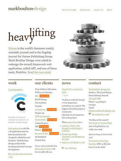
In the image above, even though the content is not visually uniform, the clear vertical grid makes organization obvious. The content in the lower section of the layout is arranged according to category and even though there is no visible structure, each bit of content is clearly defined and easily associated with its appropriate category. All of this is made possible by the employment and perception of good continuation.
Conclusion
These principles are among the more fundamental of the Gestalt Principles. They reference ideas that we all intuitively understand, so you should have no trouble bringing these principles into your design work automatically and intuitively. Whatever else you do to achieve distinction and association among design elements, Gestalt Principles should be utilized as the foundational mechanisms.
By now you’ve realized that the different principles often work toward the same result, but each has its own unique character, context, and strength. Make a practice of being efficient in your application and exploitation of these principles; use the least amount possible. Don’t employ three of them when one will do. That way, you work to maintain elegance and invisibility. And design should almost always be elegant and invisible. It follows that efficiently applied fundamentals are always superior to heavy-handed stylistic techniques. I hope, therefore, that you look beyond this article and the ones previously presented and continue to research Gestalt Principles and find ways to apply them in your work.
References:
- Universal Principles of Design, by William Lidwell, Kritina Holden, and Jill Butler
Gestalt Principles Series:
- Gestalt Principles 1: Figure/Ground
- Gestalt Principles 2: Similarity
- Gestalt Principles 3: Proximity, Uniform Connectedness, and Good Continuation
- Gestalt Principles 4: Common Fate
- Gestalt Principles 5: Closure
* * *
Hero photo by Steepwiki.